|
|
 |
|
|
 |
 |
Colors Express Emotions
|
| |
As the saying “ten people, ten colors” suggests, colors have their own emotional associations. The many colors created through the combination of the three principal color elements known as the three chromatic properties, hue, value, and chroma, express the various color tones. Tone is described in terms of attribute pairs such as light-deep, bright-dark or strong-weak. Thus, the color red come as a light or a deep red, as a bright or dark red, or as strong or weak red. The richness or fullness of expression associated with a color is determined by the way in which we express its tone.
As shown in Fig. 1, tone generates an intuitive color impression or image resulting from a complex overlaying of value (brightness) and Chroma. With this conceptual background, we are equipped to take a closer look at the world of color expression. |
|
Hue-H-Color
|
| |
This describes the relative brightness of colors. As well as differentiating colors by their hues, we can express them as brighter or darker. Bright yellow is a pure bright color. Clear blue, though pure, is a darker color. The color of the sky is clear and bright, but olive has a color value that is dark. Color brightness increases as we go up from the bottom to the top of Fig. 1. Bright colors are crisp and refreshing, giving a pleasant, cheerful impression. Dark colors are heavy and subdued. This is the dimension of color “weighting.” |
|
Chroma-C-Brilliance
|
| |
Apart from hue and brightness, colors can be differentiated by their brilliance or strength. Take the red color range. You may have the powerful glow of the red “sun” in the Japanese flag or a somber brick-red. The brownish-green that is the plumage color of the warbler is a dull yellow-green whereas foliage in the sunlight of early summer is a brilliant green. The brilliance or dullness of colors can be expressed in quantitative terms on the basis of chroma (C). A brilliant color stands out and strikes us as gorgeous. A dull color creates a quiet, subdued impression, the image we frequently associate with gentler, more refined colors. This is the dimension of color brilliance. |
| |
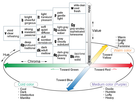
Fig.1 : Emotional Expression of Color |
|
|